

Every comprehensive patient recruitment campaign should include digital advertising and a place to send patients: a clinical trial recruitment website. It's one of the best ways to connect with patients who may be interested in your clinical trial. If you are unfamiliar with digital advertising, our handy guide will get you up to speed.
One of the key components of an effective digital advertisement is the call-to-action. This is where you entice potential patients to take the next step down the recruitment funnel. Most often that next step is a visit to your website so they can learn more about the clinical trial and opt-in to be contacted regarding participation.
But where do you send them? Chances are, the goal of your campaign is to maximize the number of patients who leave their contact info. The best way to do that is with a special type of web page called a landing page. Landing pages are carefully crafted to minimize friction, increasing the likelihood a visitor will opt in to be contacted. In fact, the quality of your landing page can mean the difference between connecting with 10 patients and connecting with 100.
In this guide we'll take a look at the components of a landing page and how to best utilize them. Then, once you are familiar with the basics, we'll look at a few tips to take your landing pages to the next level.
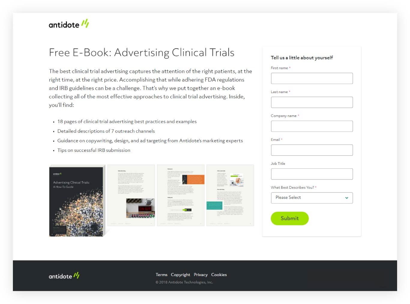
This landing page from Antidote utilizes all the advice from this article
Landing pages 101
There are five standard components that you will typically find in a landing page:
- Navigation
- Copy
- Call-to-action
- Visuals
- Footer
Let's take a look at each one individually.
Navigation
The navigation bar is a standard user interface (UI) component that you will find on most websites – typically along the top of every page. It usually contains an organization's logo and provides a way for visitors to navigate the website's many pages through a hierarchical collection of text links.
While great for helping a visitor find the information that is relevant to them, easily accessible navigation can be a distraction when you want a visitor to take a very specific action, such as filling out the form on your landing page. It is for that reason that best practices suggest stripping down your landing page's navigation to the bare necessities. Typically it would contain nothing but your company logo.
However, there may be times when adding supplemental information is warranted. If you find that your landing page is getting a lot of visitors, but not many conversions, you might include a phone number so that they can reach out to you directly. This is a great way to keep them engaged and provide the additional information they are looking for.
Copy
People have notoriously short attention spans when it comes to browsing the web. Therefore one key to an effective landing page is keeping your message short and to the point. The more quickly you can hook them with your offer, the better.
Your landing page’s headline should clearly state the intent of the page so as to quickly orient visitors. "Clinical trial to test new asthma drug" is a much more directly relevant headline than "Most asthma sufferers don’t use an effective treatment."
Following the headline should be a short description of the trial. You may want to include any important eligibility criteria. Bulleted lists are a great tool for this. The goal is to communicate only the most important info as succinctly as possible and then direct their attention to the call-to-action.
Call-to-action
The call-to-action (CTA) is the main focus of the landing page. It is the primary interaction you want a visitor to take, usually in the form of a button to click, or a form to fill out.
To maximize the effectiveness of a CTA button, it should stand out on the page. The best way to do that is with visual contrast through color, size, or location. Or, ideally, all three. A big orange button at the top of the page will garner more clicks than a small grey one near the bottom. If your landing page is long, you might stick buttons at both the top and bottom. The same basic design principles apply to CTA forms as well. The more visible it is, the more likely it will be interacted with.
Just as important as the visual design is the messaging used. The text on a CTA button, whether stand-alone or as part of a form, should communicate the action the visitor is taking by clicking it. So rather than labeling it with something generic like "Submit" you will likely have greater success with a more descriptive phrase like "Show me more" or "Schedule a call".
One more important consideration for CTA forms is the number of fields. The fewer the number the more likely a visitor is to fill it out. Therefore it is important to weigh your needs with your wants and ask for as little information as possible while still meeting your needs. Once they’ve expressed interest in your trial by filling out the form you will earn the opportunity to request additional information further down the funnel.
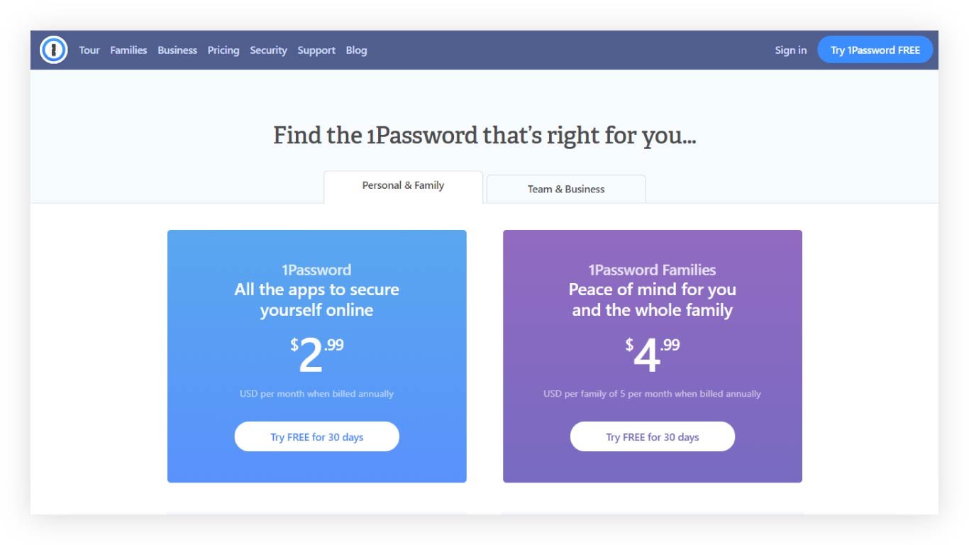
1password does a great job of presenting options for multiple audiences
Visuals
When you think of messaging your mind most likely goes to the copy. But visual messaging, in the form of imagery, color palette, and layout, is just as important for communicating the value of your trial and organization.
Imagery and copy should reinforce each other to tell a more complete story. If your trial targets a specific demographic, it might make sense to include a picture of someone of that demographic. Or, you might use imagery that reflects a common shared experience. The better the imagery resonates with your audience the more they will trust that you have their best interests at heart.
The color palette of your landing page will most often reflect the color palette of your organization. There may be times, however, where it makes sense to stray from that practice. If you were running a clinical trial for lupus patients, for example, including the color purple in your landing page could help convey your proximity to the cause, which in turn builds trust.
The arguably most important visual component of your landing page is the layout. It is how you will lead visitors through the story of your trial. Information should be grouped and ordered, separated by whitespace, to create a clear narrative structure. Doing so will help you avoid pitfalls such as presenting visitors with a CTA before you have communicated its value.
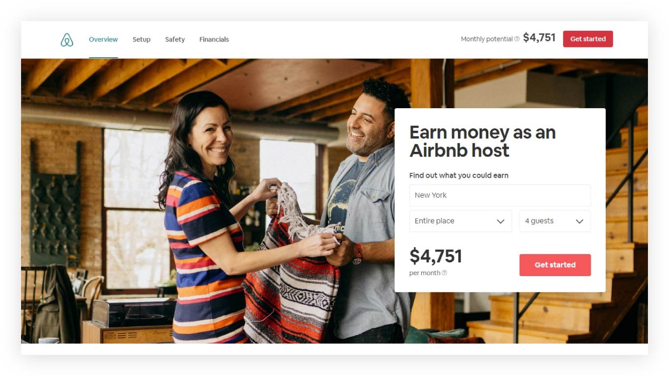
The visitor's eye is immediately drawn to the form in this landing page design from Airbnb
Footer
The last (literally and figuratively) component of a landing page is the footer. Generally, website footers serve a similar function as the main navigation, to help visitors find the information they are looking for. Where they differ is in the amount and types of links. Footers typically link more broadly and deeply than the main navigation and include pages not as directly relevant to the visitor journey.
In other words, they can be just as counterproductive to conversion as the main navigation. Therefore they should be reduced to only the most necessary information like your terms of service, privacy policy, or any other items which are legally required. Anything else dilutes the effectiveness of your landing page.
Tips
Now that we’ve looked at the anatomy of a landing page, let’s look at a few tips that will take your landing page to the next level.
Visibility
The portion of a web page that is immediately visible, without scrolling the screen, is referred to as "above the fold," in reference to the upper half of a newspaper from which the term is derived. The most important information, including your CTA, should be placed in this area so that it is immediately visible. Where exactly the fold lies varies from device to device, so as a general rule of thumb, you want to place your content as close to the top as possible without sacrificing usability.
Consistency
Whether coming to your landing page from an ad, email, or anywhere else, consistency in your messaging and visual language across mediums is imperative. Build all your materials in unison to best communicate your story and build trust.
Focus
As we mentioned previously, landing pages should serve one function, and one function only: to convert visitors into leads. If an element of the design doesn’t directly support that goal, get rid of it.
Experimentation
While the basic design principles outlined here will give your landing page a solid foundation it is important to experiment and see what works best for your audience. Try adding additional information in the form of a user testimonial. Highlight some statistics from a previous successful trial you’ve run. Experiment with different layouts, headlines, or imagery. Chances are you will make your good landing page a great one with a little experimentation.
Closing thoughts
The beauty of a well crafted landing page is its simplicity. By turning down the noise you can more effectively empower patients to take action to help advance medical research.
Topics: For Sponsors
